
Process of Offbeat: The Beginning (Part 1)

Disclaimer: I’m a first time font designer!
So why am I showing my process? I hope showing my beginner process makes font design less intimidating for other newbies. Type design always felt overwhelming to me. But now that I’ve dipped my toe in the pool, the deep end seems a little less daunting. Now, let’s get going!
The original inspiration
I’ve always loved playing around with reverse contrast letters. From script, to all caps. One of my favourite lettering pieces I’ve done was for SAD MAG in 2021. Complimenting my signature reverse script were these funky caps. I particularly loved the slanted version. A few months after the work launched, I thought, “What if I turned this into a font?” Starting with a script font seemed like a bad idea, but an all caps display font seemed manageable.

The first draft
I started this font based on the lettering above. A thought-through concept? Nah. Established rules to guide decisions? Nope. Consideration of letter proportions? Nada. I didn’t know how to start a font, so I thought like a letterer - I just drew each letter.

Some of the ideas I liked:
The rounded A counter
The wide O/Q/C/D/G’s
The brush quality in some of the letters
Some of the things I didn’t consider, but should have:
What is the font’s foundation? What is core to the concept? Does it have too many ideas in it?
Start with a few letters first to establish rules and consistency
What kind of width and proportions do I want the letters to have?
The first font file
You may want to avert your eyes. You have been warned.

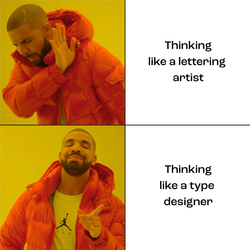
This is the first export of those sketched out letters. I was only focused on the individual letters (not the system, nor the spacing). There were some interesting details and some decent letters (the E, A and S are OK here!), but it was a flopping puppy that couldn’t jump off the couch without face planting. It needed a lot of work. I was also struggling with thinking like a lettering artist and not a type designer. Luckily, I knew some type experts that could help!
The first crit
Good thing my friend and mentor, James Edmondson (of OH no Type), graciously critiqued what I had and pointed me in the right direction! Here are some before-James and post-James samples:

BEFORE!

AFTER!

BEFORE!

AFTER!
A few great points of feedback from James:
Focus on which ideas work best and apply them as rules through the system, instead of thinking of drawing the best letters
Starting with italics doesn’t make sense! It’s harder to draw in angles vs along straight lines
Use simple spacing at this stage (60 for I’s; 20 for S’s)
OVERSHOOT!
Some things that still needed improvement
Some letters needed tweaks (S, P, R, well all of them really lol)
Some letters needed overhauls (X, Y, G)
Weight across letters needed balancing (K looking real light next to R)
Takeaways
In hindsight, a lot of the early feedback seem obvious now. But as a complete beginner, I didn’t know anything. Watching James make edits on my font file in real-time was eye opening for me. I learned how to be more efficient with shortcuts and anchor/handle manipulation. But more importantly, I got to hear how he thought through all those little decisions that goes into type design (just like graphic design!). I absorbed how to think like a type designer, not a lettering artist. This totally shifted my thinking in the best way possible.
And I think that’s where I’ll end it for today! In the next post, I’ll break down the meaty middle part of the process. Have questions? Feel free to email me at hi@lisataniguchi.com, or DM me on Instagram. Thanks for reading! Here’s a gold star ⭐️
